The Hidden Challenge of Visual Consistency

One of the most overlooked yet demanding aspects of web design is achieving visual consistency. While content creation and functionality often take priority, misaligned images and uneven text blocks can quickly undermine an otherwise well-built website. This challenge becomes even more complex when pages rely on grids, cards, or columns to present information.
Image Alignment: More Than Just Resizing
Images rarely come in uniform sizes. They vary in height, width, resolution, and focal points. Aligning them properly requires intentional resizing, cropping, and positioning. Without this effort, layouts appear disjointed and unbalanced.
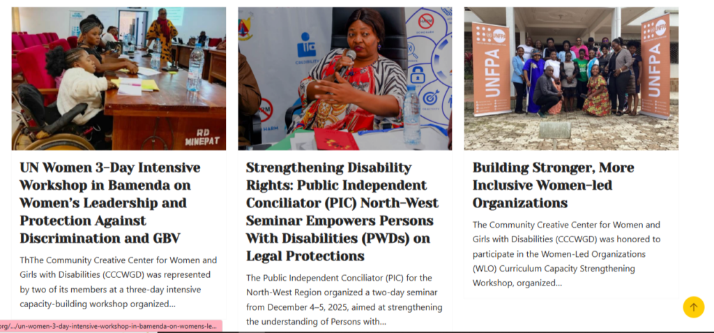
A clear example can be seen on the Community Creative Center for Women and Girls with Disabilities (CCCWGD) website, particularly in sections displaying multiple blog posts or program highlights. When images are consistently resized and aligned within the same grid, the page looks structured and professional. However, when image heights differ, visual flow is disrupted, causing titles and content below to misalign.
Equal Content Length and Layout Balance
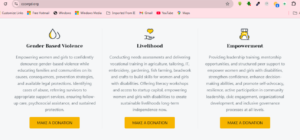
Equally important is maintaining a relatively equal number of words or characters across similar content blocks. On the CCCWGD homepage, sections such as program descriptions or blog previews demonstrate how varying text lengths can affect alignment. When one description is longer than others, call-to-action buttons and icons no longer sit on the same horizontal line, creating visual imbalance.
This issue becomes even more noticeable on mobile devices, where uneven content heights can stretch layouts and reduce readability. As a result, designers must often edit or structure text intentionally to maintain balance.
Why Web Designers Need Graphic Design Skills
Many web designers focus heavily on code and frameworks but underestimate graphic design fundamentals. Skills such as spacing, proportion, visual hierarchy, and typography are essential for solving alignment problems. Without these basics, even responsive layouts can feel cluttered.
The Value of Working With Graphic Designers
Collaborating with professional graphic designers helps bridge this gap. Graphic designers ensure images are optimized correctly and guide how content should flow visually. On platforms like the CCCWGD website, this collaboration is crucial for presenting advocacy work in a clear, credible, and engaging way.
How to Practically Achieve Better Alignment
To address these challenges effectively, designers should adopt a few practical strategies:
- Standardize image dimensions before uploading, using tools like Photoshop, Canva, or Figma.
- Crop images consistently, focusing on similar focal points.
- Set fixed image ratios (e.g., 4:3 or 1:1) within the website layout.
- Limit text length by defining maximum word or character counts for similar sections.
- Use CSS or page builder controls to enforce equal card heights.
- Test layouts across devices to ensure alignment holds on mobile and tablets.
Conclusion
Image alignment and equal content length are not minor details—they are core elements of effective web design. Whether through learning basic graphic design principles or collaborating with professionals, addressing these challenges leads to cleaner layouts, stronger credibility, and a better user experience.

